
Cryptocurrency markets are known for their rollercoaster rides, and Polygon (MATIC) is no stranger to this volatility. If you’re keeping an eye on your MATIC holdings, you’ve likely noticed some recent price action. Let’s dive into the latest movements to understand what’s happening with Polygon and what these shifts might mean for the near future.
Polygon Price Update: A 24-Hour Dip Amidst Weekly Gains
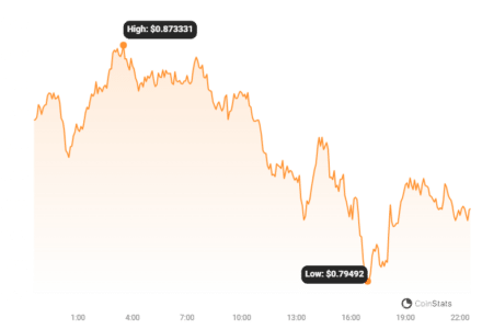
As of today, Polygon’s price is hovering around $0.82. Over the last 24 hours, we’ve seen a decrease of 8.6%. Now, that might sound concerning at first glance, especially in the fast-paced world of crypto. However, zooming out a bit provides a more complete picture.
Looking at the past week, Polygon has actually been on an uptrend of 1.0%. It started the week at $0.82 and, despite the recent dip, has generally maintained its ground. This suggests that while there’s been a short-term pullback, the overall weekly performance is still positive.
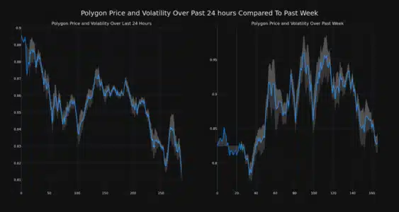
Understanding Volatility: Are Bollinger Bands Telling the Story?
To better understand these price swings, let’s talk about volatility. Volatility essentially measures how much the price of an asset fluctuates over time. High volatility means prices can change dramatically and quickly, while low volatility suggests more stable price movements.
One tool often used to visualize and measure volatility is Bollinger Bands. These bands, represented by the gray areas in the charts below, widen when volatility increases and narrow when it decreases. Think of them as dynamic price ranges that adapt to market fluctuations.
The chart below gives us a visual comparison:
- Left Chart (24-Hour View): This shows Polygon’s price movement and volatility over the last 24 hours. Notice the width of the Bollinger Bands.
- Right Chart (Weekly View): This illustrates the price movement and volatility over the past week. Compare the Bollinger Band width here to the 24-hour chart.
Read Also: Dogecoin Soar After Astrobotic Technology Literally Plans To Take It ‘To The Moon’
Key takeaway: Wider Bollinger Bands indicate higher volatility. By comparing the 24-hour and weekly charts, we can see how volatility has shifted over these different timeframes.
Trading Volume and Circulating Supply: What’s the Trend?
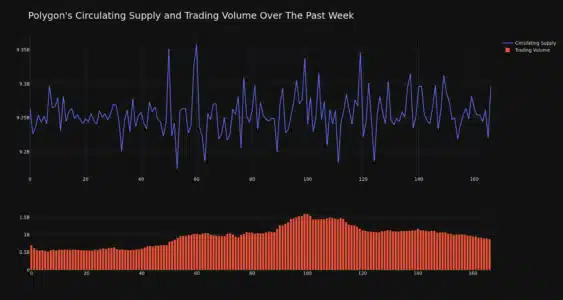
Price isn’t the only indicator to watch. Let’s look at trading volume and circulating supply, as these can offer further insights into the health and activity of the Polygon network.
Positive Signs: Trading Volume Increase
- Over the past week, Polygon’s trading volume has climbed by 24.0%.
- Increased trading volume often suggests heightened interest and activity in the market. It can be a sign of growing adoption or renewed enthusiasm for the asset.
Circulating Supply: Nearing Max Capacity
- The circulating supply of MATIC has also increased by 0.35% over the last week.
- This brings the current circulating supply to 9.26 billion MATIC.
- This represents a significant portion – approximately 92.6% – of Polygon’s total max supply of 10.00 billion MATIC.
- As the circulating supply approaches the max supply, the rate of new tokens entering circulation will naturally decrease. This can sometimes have implications for price dynamics, although it’s not the only factor at play.
Market Cap and Ranking: Where Does Polygon Stand?
Market capitalization, or market cap, is a crucial metric for understanding the overall size and dominance of a cryptocurrency. It’s calculated by multiplying the circulating supply by the current price.
According to the latest data, Polygon’s current market cap ranking is #12. This places it firmly within the top tier of cryptocurrencies. Its market cap currently stands at $7.53 billion.
Maintaining a position in the top 15 cryptocurrencies by market cap is a testament to Polygon’s established presence and the significant value investors place on the network.
In Conclusion: Navigating Polygon’s Price Fluctuations
While the recent 24-hour price dip of 8.6% might cause some short-term concern, it’s essential to consider the broader context. Polygon has shown a positive weekly trend, and the increase in trading volume suggests ongoing interest in MATIC. Understanding volatility, as visualized through Bollinger Bands, helps to contextualize these price movements as part of the dynamic nature of crypto markets.
Keeping an eye on metrics like circulating supply and market cap ranking, alongside price charts and volatility indicators, provides a more well-rounded perspective for anyone following Polygon. Remember that the cryptocurrency market is inherently volatile, and conducting thorough research and understanding risk are always paramount.
Disclaimer: The information provided is not trading advice. Bitcoinworld.co.in holds no liability for any investments made based on the information provided on this page. We strongly recommend independent research and/or consultation with a qualified professional before making any investment decisions.
Disclaimer: The information provided is not trading advice, Bitcoinworld.co.in holds no liability for any investments made based on the information provided on this page. We strongly recommend independent research and/or consultation with a qualified professional before making any investment decisions.