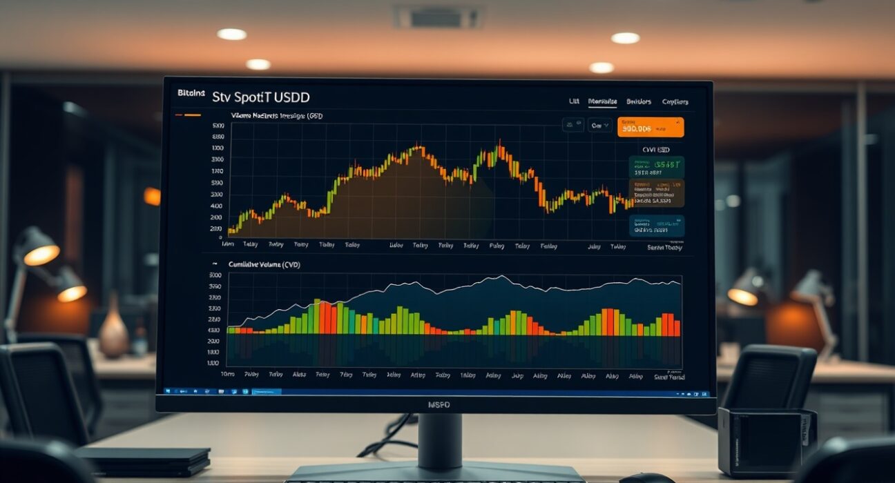
For traders monitoring Bitcoin’s spot market, the Cumulative Volume Delta (CVD) chart for the BTC/USDT pair offers a granular look at order flow dynamics. As of 5:00 a.m. UTC on July 6, the chart reveals how buy and sell orders of varying sizes are shaping short-term price action. The analysis combines two key layers: a Volume Heatmap at the top and the CVD indicator below, each providing distinct signals about market sentiment and potential support or resistance levels.
Decoding the Volume Heatmap
The upper section of the chart displays a Volume Heatmap that tracks trading activity at specific price levels. The background color intensifies when the price lingers in a particular range or experiences a significant move. These brighter zones can indicate areas where large volumes have been executed, often acting as potential support or resistance zones. For example, a high-intensity band near a recent price level suggests that a substantial number of trades occurred there, making it a level worth watching for future price reactions. Traders use these visual cues to identify where liquidity may be concentrated.
Understanding the Cumulative Volume Delta (CVD)
The lower section of the chart presents the Cumulative Volume Delta, which categorizes buy and sell orders by size. Each colored line represents a specific order size bracket. An increase in buy orders causes the corresponding line to rise. For instance, the yellow line tracks orders between $100 and $1,000, while the brown line represents large-scale orders between $1 million and $10 million. This segmentation helps traders distinguish between retail activity and institutional or whale movements. A rising brown line, for example, signals that large players are accumulating or distributing, which can have a disproportionate impact on price direction.
What the July 6 Data Suggests
At the time of the snapshot, the CVD lines showed a notable divergence between smaller and larger order categories. While retail-sized orders (yellow and orange lines) remained relatively flat, the brown line representing orders above $1 million displayed a gradual upward slope. This pattern often indicates that institutional participants are building positions, potentially laying the groundwork for a larger move. However, the Volume Heatmap showed no extreme concentration at current levels, suggesting that the market may still be searching for a decisive breakout point. Traders should watch for a confluence between heatmap intensity zones and CVD line movements to confirm strong support or resistance.
Why This Matters for Traders
Understanding the interplay between the Volume Heatmap and the CVD provides a more complete picture of market depth than price alone. The heatmap reveals where trading activity is concentrated, while the CVD shows the direction and size of the flow. Together, they help traders identify whether buying or selling pressure is driven by large players or retail participants. For the BTC/USDT pair on July 6, the data suggests that large orders are driving the current flow, which could signal an impending volatility event. Traders using this analysis can better anticipate key levels and adjust their strategies accordingly.
Conclusion
The Spot CVD chart for BTC/USDT at 5:00 a.m. UTC on July 6 highlights a market where institutional-sized orders are increasingly influencing price action, while retail activity remains subdued. The Volume Heatmap does not yet show a clear concentration of volume at a single price level, indicating that the market may still be consolidating. Traders should continue monitoring the CVD lines for shifts in large-order flow, as these often precede significant price movements. This type of order book analysis remains a valuable tool for those looking to understand the underlying forces driving Bitcoin’s spot market.
FAQs
Q1: What is the difference between the Volume Heatmap and the Cumulative Volume Delta?
The Volume Heatmap shows the intensity of trading activity at specific price levels, highlighting where large volumes have been executed. The CVD tracks the net difference between buy and sell orders, categorized by order size, to show the direction and strength of order flow.
Q2: How can traders use the CVD line colors to make decisions?
Each color represents a different order size bracket. For example, yellow tracks orders between $100 and $1,000, while brown tracks orders between $1 million and $10 million. A rising brown line indicates large-scale accumulation or distribution, which can signal potential price moves driven by institutional activity.
Q3: Does a rising CVD line always mean the price will go up?
No. A rising CVD line indicates more buy orders than sell orders in that size category, but the price may not immediately follow if sell pressure from other brackets offsets it. Traders should look for alignment across multiple size categories and the Volume Heatmap for stronger signals.
Disclaimer: The information provided is not trading advice, Bitcoinworld.co.in holds no liability for any investments made based on the information provided on this page. We strongly recommend independent research and/or consultation with a qualified professional before making any investment decisions.