
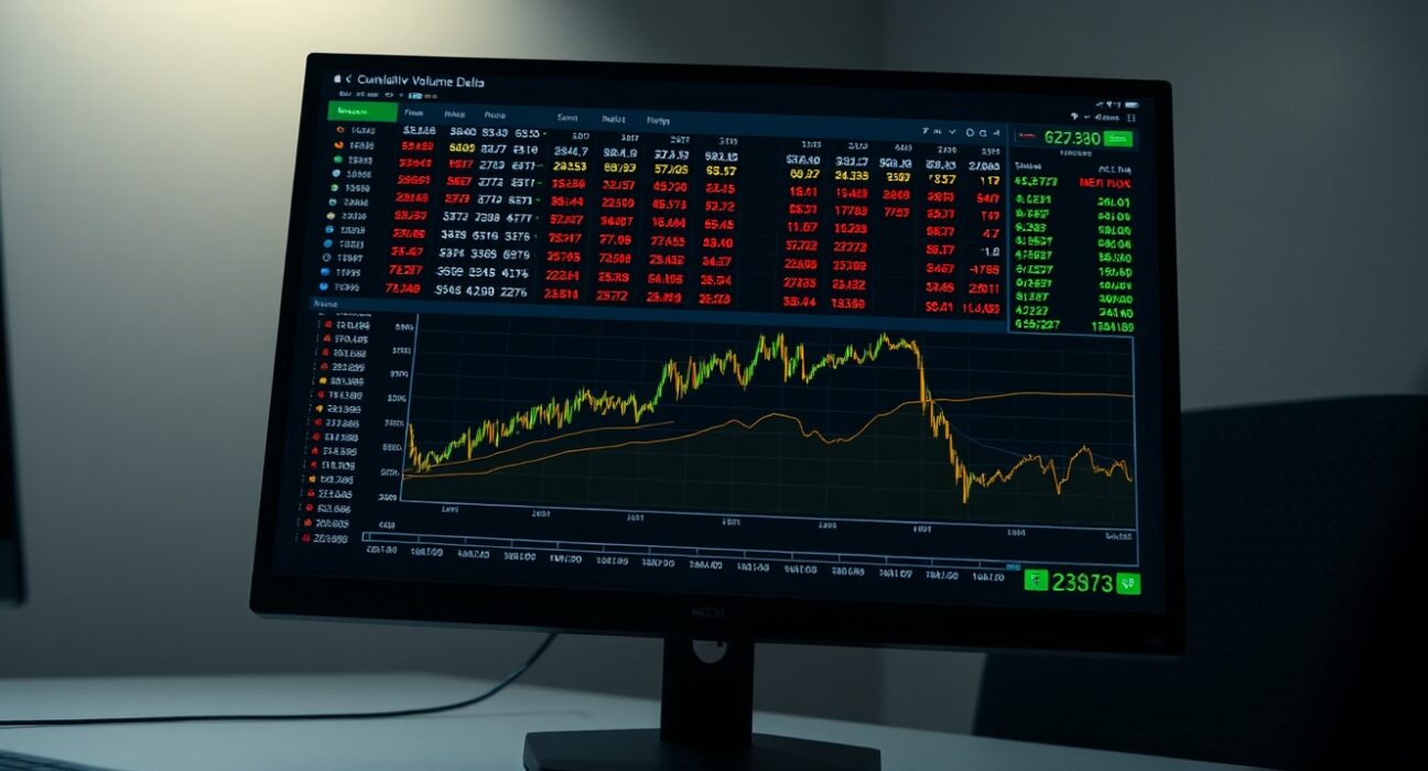
On June 30, the BTC/USDT spot Cumulative Volume Delta (CVD) chart provided traders with a detailed view of order book dynamics and volume concentration at key price levels. The analysis, based on data as of 10:00 a.m. UTC, combines a volume heatmap with the CVD indicator to offer insights into buying and selling pressure.
Understanding the Volume Heatmap
The volume heatmap tracks trading activity across specific price ranges. When the price lingers in a particular zone or moves sharply through a level, the background brightens. These brighter areas often indicate where significant trading volume has occurred, potentially marking future support or resistance levels. For example, a zone with high volume concentration may act as a price magnet or a barrier, depending on the direction of the breakout.
CVD Indicator: Order Flow by Size
The CVD indicator breaks down buy and sell orders into size categories. As buy orders in a specific size range increase, the corresponding colored line rises. The yellow line represents orders between $100 and $1,000, typically associated with retail traders. The brown line tracks large-scale orders between $1 million and $10 million, often linked to institutional activity or whales. A divergence between these lines can signal shifts in market sentiment—for instance, if large orders accumulate while retail activity declines, it may suggest smart money positioning.
What This Means for Traders
For active BTC/USDT traders, the CVD chart offers a real-time window into order flow imbalances. A rising CVD for large orders, combined with a volume heatmap showing bright zones at current price levels, may indicate strong support. Conversely, if the CVD for large orders falls while the price approaches a bright zone, that level could break. The key is to watch for confirmation from both indicators before making trading decisions.
Conclusion
The BTC/USDT spot CVD chart as of June 30 provides a granular look at order book activity. By combining the volume heatmap with size-based CVD lines, traders can better gauge where institutional and retail interest converges. This data-driven approach supports more informed entries and exits, especially in volatile market conditions.
FAQs
Q1: What does the volume heatmap on the CVD chart show?
The volume heatmap displays trading volume at specific price levels. Brighter zones indicate higher trading activity, which can act as potential support or resistance areas.
Q2: How should I interpret the colored CVD lines?
The yellow line tracks orders between $100 and $1,000 (retail), while the brown line tracks orders between $1 million and $10 million (institutional). Rising lines indicate increasing buy orders in that size category.
Q3: Can the CVD chart predict price movements?
No indicator is predictive, but the CVD chart helps identify order flow imbalances and volume concentrations that may influence short-term price action. It is best used alongside other technical tools.
Disclaimer: The information provided is not trading advice, Bitcoinworld.co.in holds no liability for any investments made based on the information provided on this page. We strongly recommend independent research and/or consultation with a qualified professional before making any investment decisions.